Neri Oxman

Neri Oxman, a multi-award winning American–Israeli architect, designer, and professor at the MIT Media Lab, where she leads the Mediated Matter research group. Known for art and architecture that combine design, biology, computing, and materials engineering.

Her work embodies environmental design and many of her projects use 3D printing and fabrication techniques. They include the Silk Pavilion, spun by silkworms released onto a nylon frame, Ocean Pavilion, a water-based fabrication platform that built structures out of Chitosan (a sugar that is obtained from the hard outer skeleton of shellfish) CPD3, the first 3D printer for optically transparent glass and a set of glasswork produced by it, and collections of 3D-printed clothing and wearables worn in couture shows and performances.

She has previously collaborated with the singer Björk in which she produced Rottlace, a set of 3D-printed feathered, filamented, and textured masks. Based on a 3D scan of her face. Björk wore these in the world’s first 360° VR performance. She also began designing Vespers, a collection of 15 death masks. Described as “like something out of Alien“, each mask is a curved translucent shell the size of a face, within which a detailed pattern is printed in clouds of color and shadow. This tested the limits of how small voxels of colour could be inside a 3D printed solid. 

A lot of scientific jargon, to which, I haven’t got the faintest idea about. But, what I do know and can fully appreciate is the beauty of these works.

Something otherworldly and ethereal, I find these masks to be truly fascinating. Alien, like nothing I’ve ever seen before. The detail on all is remarkable, and the marbled colour effects used in the Vesper series I find alluring almost drawing you in.

Each set of masks could easily be mistaken for unknown species from elsewhere in space and deep undersea, in particular the Vespers-like some distance relative of jelly-fishes.

I can envision the likes of these masks, being used in a McQueen fashion show. In particular, “Plato’s Atlantis” McQueen’s final womenswear show before his untimely death in 2010. As described by the title, the show had an aquatic theme. Where models with dressed in aquatic, almost alien-like dresses and had a look that looked like another race of humanoid beings. This show also gave birth to the Lady Gaga “Armadillo Boot” 


Below: ‘Rottlace’ Images curtesy of Björk/Neri Oxman/https://www.dezeen.com/2016/06/30/bjork-3d-printed-rottlace-mask-musculoskeletal-system-neri-oxman-stratasys/


Below: Vespers’ Images curtesy of Neri Oxman/https://www.dezeen.com/2016/11/29/neri-oxman-design-3d-printed-ancient-death-masks-vespers-collection-stratasys/


Fleur Isbel

Fleur Isbel, an award winning English graphic artist/designer whose abstract works are bold and colourful .

Stumbling across her works only recently via Pintrest (my obsession!), i instantly fell in love with her distinct style and playful use of colour. Already, I consider her to be a huge inspiration to me and her works are what i can only aspire to achieve one day. I will continue to reference her work throughout my studies and my career.

Experimenting is king in all of Fleur’s work. And is clear to see.  By exploring new processes as a tool to discover, uncover and generate original ideas spanning multi disciplines.

Simple movements of a mouse, experiments with printers and photocopiers, to forcing a glitch on loadup of a computer. Nothing is off limits, when it comes to creating works. All beautifully captured and rendered into these amazing pieces.

Touted as being a “top designer to watch” and as a “rising star.” by Creative Review and It’s Nice That, respectively,  Fleur was hand-picked by then D&AD president Neville Brody to design the prestigious D&AD annual in 2013.

With the main theme of the annual was about D&AD’s global reach and potential. Using geolocation and weather data for each of the 196 countries in the world a code-generated coloured pattern for each; the 42 countries was created.

“I started to think about how we create and what’s the role of technology and digital media, and how does this influence how we connect in the world.

96 country illustrations on the cover to reflect creativity being open for the world. Each pattern has been generated by code from meta data and location data from the day D&AD’s entries opened for this year – that date was the 1st nov 2012.

To represent the country’s location in the world the patterns have a shifting horizon line reflecting a nation’s latitude, which also aims to convey a ‘new’ horizon of creativity.”


As you can see from the examples above, there is beauty in the simplicity of her work. Her work is expressive, yet fun and clever too.  And you should know by now just how much i love bold vibrant colours.


Go check out Fleur’s work for yourself @: https://fleur.isbell.net/

Promise you won’t be disappointed!


Cultural exploits at the Saatchi Gallery….

I needed a break from uni…

A break from thinking. A break from everything. I wanted to switch off and enjoy this taste of what seems to be an apparent early spring, and be out in the sun, before the inevertable happens and the weather turns once again.😫

The Saatchi Gallery is one of my favourite galleries. I love the space, the architecture and the cool contemporary exhibits. Plus it was an excuse to wonder along the Kings Road, grab some lunch and pop into my favourite book publishing houses, shops – Taschen and try to resist the urge to throw all of my money at them. My resolve was strong.

Admittedly, I cannot actually remember my last visit to the gallery and from checking the website, I noticed that it was due to close from the 24th of Feb until mid-March. Clearly the universe was giving me a sign.

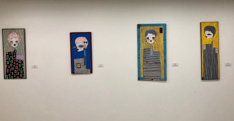
Wondering around the galleries I’m really glad I decided to come. I discovered incredible works of art by artist that was unknown to me and even inspiration from artists selling their works in the gallery shop. (Again, my willpower was strong!) I left, pleased with my spur-of-the-moment decision to visit and left, armed with a list of names of artist to “follow”/”stalk” for when I finally join instagram along with  the rest of the planet. 🙄

Dominic Beattie: Pattern Studies.

Dominic Beattie, an abstract artist and contemporary furniture designer from London. His work is based around the modernist movement who’s current outputs are these striking patterned prints.

Why do I like it? They are bold, bright, colourful and full of life. Anything like this, I am all over!

Benjamin Murphy: Philosophy of Discomfort.

Benjamin Murphy is a visual artist and writer based in London. Primarily, he creates monochromatic figurative artworks using the esoteric medium of electrical tape.

Why do I like it? His artistry. His style of art. A style of art that is often empolyed in erotic art. The intricate detail. The monochromatic colour scheme. How it is constructed using layers that are overplayed, with a background, a middle and a foreground.

ALO: Exit from Aden. 

ALO is an Italian artist based in London. Inspired by the Expressionist style works both outdoors and in the studio. He describes his style as ‘Urban Expressionism’.

Why do I like it? It’s simplicity. The outline drawing style. The contrast between the monochromatic and the bold colour. The texture and patterns.

Georgll Uvs: Fall Circle: The Beauty of Inevitability.

Russian artist, Georgll Uvs takes the viewer on a journey from the Mesozoic era, to Genesis and the creation of life. By experimenting with different single pigments and mixed ultraviolet reactive pigments. In doing so, he has pioneered a new approach to abstract art, a process that brings phenomenal significance and intense substance to his ever-changing works.

Why do I like it? I loved everything about this exhibit, which is flooded in ultra violet light. The reaction between this light and the paint pigments leave such an intense luminosity of colour, like never seen before and changes before your very eyes. The abstract nature of the pieces really give a sense of life exploding into fruition.

Below: Other things that caught my eye whist wondering the galleries….


Thinking outside the box with Ewen Farr

Hothouse Talk….


Today in the fourth of The Cass’s hothouse talk series, in visual communications.

Ewen Farr is an animator and illustrator whose hand-drawn aesthetic is colourful and humorous. An independent artist, Ewen also has worked for major labels such as Universal and Island Records, with his unique and lo-fi methods bringing originality to the music video industry.

Unfortunately, we have a CCS deadline approaching (this coming Tuesday) which means I won’t be able to attend this talk. As like Cinderella, I will be confined to my house woking on my essay all weekend.

Gutted, as I would have loved to have gone. This talk was intentionally curated for us, specifically during this term as we are obviously doing an animation project. So this would have been a prefect opportunity to talk to a real life practitioner, hear his story and pick up tips and advice for not only our projects, but going forward in our careers. What would have been great, is if Ewen did a workshop with us (but these privileges seem to only be reserved for levels 5 & 6 students)

Emily previously had shown me some of Ewen’s work. I really like his lo-fi approach and that his animations have this beautiful,  rough hand-drawn, playful felt-tip and crayon aesthetic. I love the way he manages to capture the textures of these mediums on film. And that his work isn’t polished or glossy. They are simply his drawings come to life.

Hopefully I can catch this talk again, somewhere in the not to distant future, where It doesn’t clash with another deadline!


Boston Elements

“Boston” is a contemporary American queer artist who’s sex positive works are an unashamedly celebration of queer expression, culture and the male form.

Motivated by the frustration and the shame surrounding natural sexuality, Boston, “seeks to familiarize the world with passion’s innocence”. Inspired by the the male form, he explores themes of masculinity with a strong homo-narrative. Using borrowed imagery, which he then adorns with expressive lines/marks and graphic illustrations in bold colours. Much like the work produced by friend of The Cass and occasional guest lecturer – Joe Cruz.


Above images: Courtesy of: (@bostonelements)


@scientwehst.

Giulia Marsico, more commonly known as @scientwehst is a contemporary American digital artist who’s creations are a unique art form of NSFW graphic collages.

Her “fuck a beauty standard: just be you.” attitude is at the very forefront of her works and it is this self-confidence which was something that Giulia had to learn for herself. This gain in self-assurance allowed her to push boundaries regarding sexuality and censorship of the female form.

Her works are an intriguing mix of near-pornographic female photography and carefully considered architectural elements, that are ‘strategically placed’. These graphic collages once started with random pornographic collages, where Giulia would replace genitalia with images that looked ‘phallic‘ or ‘yonic‘, typically food. Over time, this process evolved into her scouting for any images that resembled the female body, which was then refined into looking for only architectural images that resembled the female form.

Above images:  Courtesy of: (@scientwehst)


Jeffrey Alan Love

Jeffrey Alan Love, a multi-award winning American artist and writer. Whose distinct illustrations are deep rooted in fantasy. Love’s unique work is mysterious and haunting, a cross between a dream and nightmare. In it’s simplicity,  they are dark and bold with continued mythic themes, which is common place within Love’s work.

Aside from being striking and atmospheric, Love has this rare ability to tease his audience. Giving just enough detail in his paintings, in order for the viewer to construct the narrative as a whole in their minds eye.

Above images: Courtesy of (@jeffreyalanlove)